
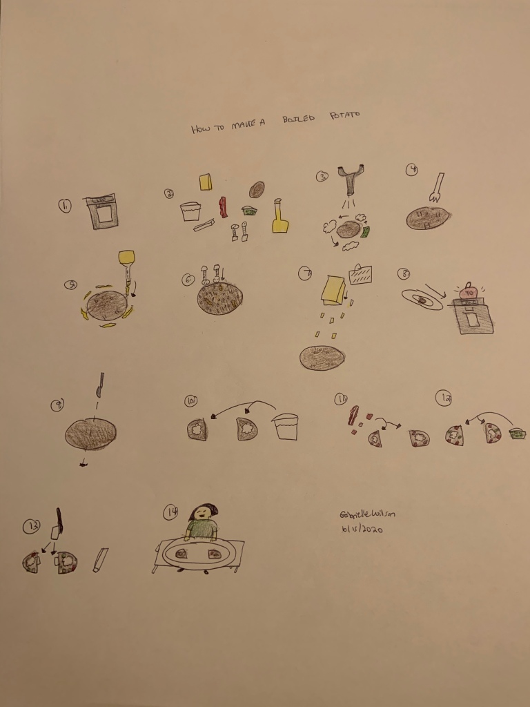
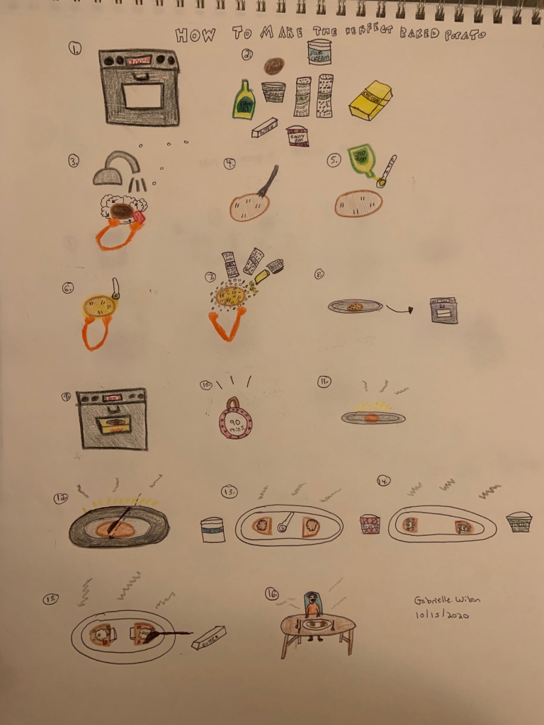
I imagined that I am working for a Magazine Publishing company creating a product for a non-English speaking child age 7-12. I headed into this assignment knowing that without the use of words and labels, the clarity of my visual must be my priority. I therefore used familiar symbols for different objects, for the ingredients, the tools, etc. I researched easy potato recipes and decided to do a basic Baked Potato recipe and I added a personal family recipe ingredient, scallions. I also researched wordless diagrams by Nigel Holmes. To do so, I went on Google Images and I looked through various designs by Holmes, which were all simplistically beautiful, showing a process that seemed almost to pop-out and that I could envision in action, yet also one clear to follow. I first did a draft and used basic shapes, textures, arrows, and I made the visual as simple as possible, just to sort of gather my own thoughts about the process and different ways of showing it. I then took a break and considered how to add to the clarity of the visual without making it too elaborate and hard to follow, since this must be clear and simple enough to understand, yet embellished enough so objects look specific and recognizable. I used words only for the writing on the items, to add to the artistic reality of the objects, like the butter, oil, salt, etc. In order to show measurements, I wrote 1 tsp. on a spoon and for the rest of the recipe there were no real measurements. I made sure the amounts, however, were clear based on the context of what fits in a spoon and what I show on the potato. I put myself in the place of my target audience and considered the ease at which someone could understand my visual. I think it is a good balance of simplistic clarity yet enough embellishment to bring it to life. I made the instructions very in-depth in my visuals, which on further thought could be even simpler. I made sure to space my instructions out well and let the steps build upon each other visually, not taking any visual shortcuts, like showing visually all the steps gradually coming together, as one should see in real life when making this recipe.
One challenge I had was when I realized I had to show every step building upon the other, meaning showing the potato as its new form from one step to the next and also having to compile certain steps, like with the cheese being grated in the same step as the salt and pepper, because I not planning ahead for each ingredient at one point. My “aha” moment was as I saw the toppings build together and could see how each step in the topping process was so clearly showed and the distinctions between steps were so clear. I might have, if given more time, found a better place with better lighting, since even when I try, it always turns out more dim than I expect. I also would have shown more measurements, as well as fewer steps. I might have found a more unique recipe as well, but I do think my recipe is simple enough for a child to follow yet also educational and fun for a child to learn. This is a meal their parents will enjoy too and meal-preparation for the family is an important skill. I relate this assignment back to what we have learned in class in terms of the use of colors, lines, textures, and symbols to represent ideas in a clear but visually appealing way. It was an important lesson on how to use strictly my visual skills in order to create a functional instructions sheet for not just any audience, but one that needs to learn through visuals. This challenged me, in a good way. I showed this to my aunt, for lack of a younger participant, and she was able to follow my guidelines, but I do realize the benefits of eventually showing this to someone of a younger age who has no prior experience with the making of “the perfect baked potato”.
