
This photo represents “color” because it captures the contrast of green and red tomatoes, varying in color due to ripeness. While it also captures “relative size” in a way because it shows the red tomato as almost too close to the lens and the other tomatoes smaller due to the distance, the main sensory principle is “color”. I am intrigued by ripeness impacting the color of a plant so I found this to be intriguing both scientifically and visually. I thought the closeness of the red to the camera also shows that it is closer to being picked. One problem I encountered was being able to capture the color contrast without capturing too much of the plant to go against the assignment’s guidelines. I think my main “aha” moment was when I was sitting outside and thinking about the different colors around me and the plant caught my eye because there is something so astonishing about how one plant can have so many colors built into its natural design. If given more time or resources, I would have tried to show the contrast so that the red tomato was clearer in the lens, and I would have perhaps found a tomato plant where the tomatoes were closer together so that I could capture the contrast in color without showing as much of the plant. When speaking to my aunt about this photo, she agreed that a tomato plant, while maybe less obvious to the eye that is looking for more unique colors, is an interesting representation of color because it plays into the science as well as the visual appearance. She works at a nursery and is exposed to plants and vegetables all day long, and to consider them beyond the edible aspect was something she does not often take the time to do, which is why the art of photography, and its correlation to Visual Communication, is so important in understanding and appreciating the world around us.

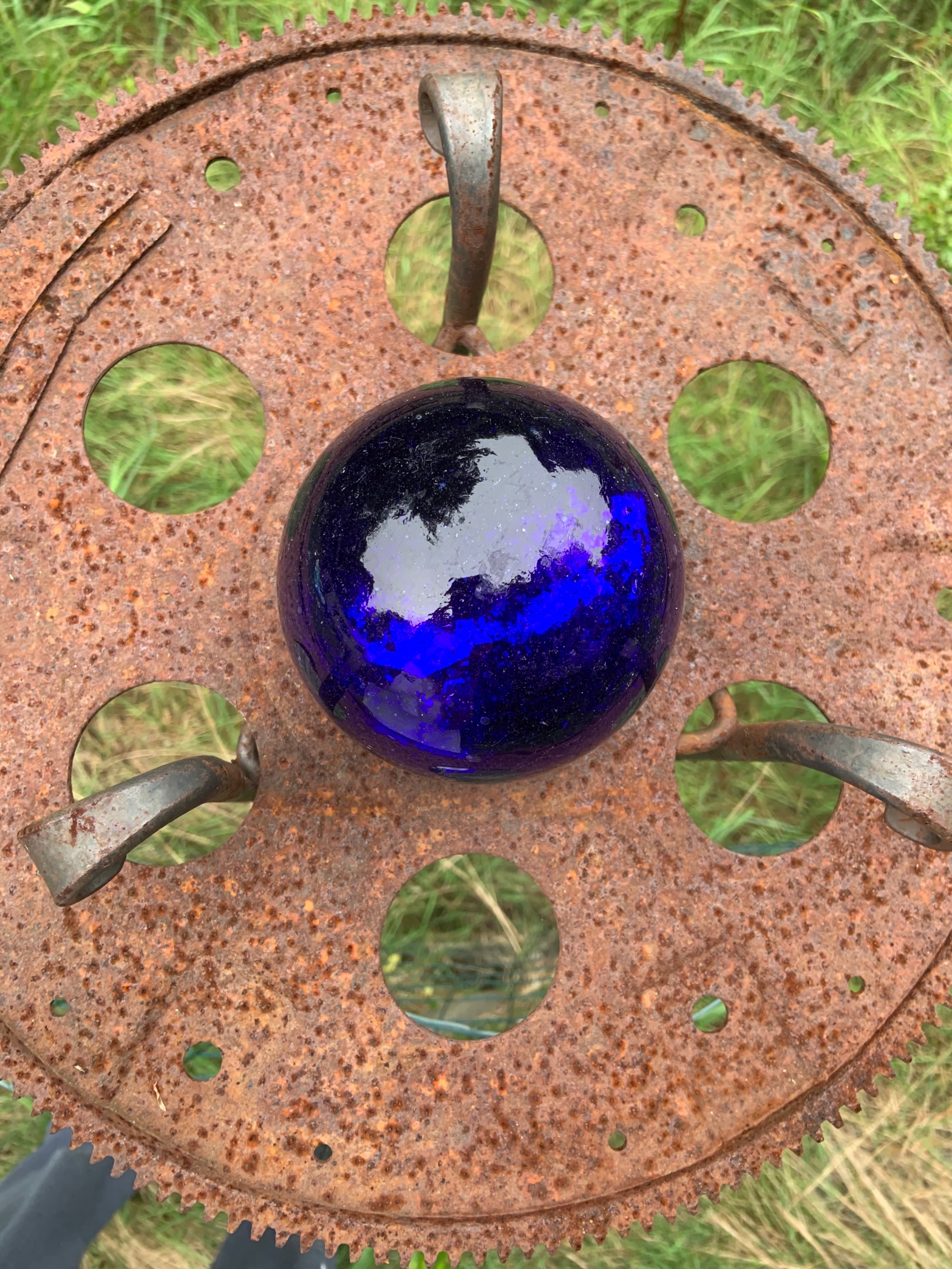
This photo captures the sensory principle of “shape” well. While I can see the shockingly beautiful color of the blue marble ball as well, I am more drawn to the circular features in the rusty platform and the global shape of the blue ball. The photo captures a circle within circles within one larger circle. In reality, the brown platform sits atop a tall structure in a garden, but from the Bird’s Eye View you see only the platform which the ball sits upon, with only three rods intervening to make you aware that there is anything below on the other side. My “aha” moment was while I was sitting eating lunch and thinking about color, when I noticed the blue ball. It seems interesting then that I would select this to represent “shape”, but as I was observing, I became more aware of the nuances in the shapes shown, features I had never taken the time to appreciate before. I think this photograph makes me proud because it captures such an unique perspective of an object, but in a way that does not detract from the overall image but adds to it, bringing more focus to the parts of the object that make it the most beautiful. My aunt looked at this image and asked, “what is that?”, which I find interesting because she placed this object into our garden herself. I realize now that from this new perspective, she was given a far more complimentary view of the blue marble texture and color, and less view of the rusty color and platform below. It is a beautiful thing to be able to show someone an object they know, in a new light, so that they recognize it as an entirely new object.


This first photo is the main visual I am using to represent “lines”. I believe the two overlapping metal pieces represent lines very clearly with the way they travel across the fire-pit cover and over each other. However, when looking more closely, one can see more subtle lines in the screen of the cover. I was trying to capture a close-up of an object I often see around my yard but never stop to take a look at closely, something that normally is just one fragment of a tool. My “aha” moment is when I noticed it randomly in the middle of my yard, in a place slightly unexpected, and I stopped and thought about the way the thicker ribbon-like pieces travel across each other and the cover. This reminded me of a present wrapped in ribbon going two ways. The more subtle screening on it is also a use of “lines” and I think this captures the lines seen in everyday mental visuals like screens we walk in and out of. I believe the way the fire-pit cover contrasts with the grass allows for a clearer view of the lines, which still allowing the screen aspect to blend in, making the viewer look deeper. This reminds me of our class activity with pointillism, when we had to incorporate colors that looked like one new color at first glance, and this screen on the cover seems to almost blend with the color of the grass, despite the contrast in the rusty brown and the green.
As for the second photo, I captured this and was reluctant to leave it out, because while it does capture a whole object, it seems to be a unique portrayal of “lines”. I have always thought a spider has the form of an umbrella, with legs to reinforce it and a body to join all the pieces together. I think the legs represent “lines” in a way, splitting the material it sits upon into 7 different “slices”, to use a pie analogy. I realize the assignment was to show a close-up, which is why I added this as an extra bonus photo to just show lines in an object people might not think of as showing this, seeing as it is not so much the object but the way it presents itself, that allows for the lines to be represented.

I believe despite the beautiful colors shown, this photo captures “relative size” best. One set of pine cones appears smaller but only due to it being farther back in the frame and farther from the lens. I was thinking about trees and objects on them as I was taking this, in terms of how the pine cones wind around the tree, almost like decorations on a Christmas tree, each set of pine cones seeming smaller and smaller due to perspective, until they wind back around toward the eye or lens, “growing” once again in the frame. In a different mindset I may have gotten a closer shot of the pine cones and considered using this for a portrayal of division of space, but I am glad I captured it from this view, so you can truly see how someone might mistake these for being different sizes, if not trained in the art of Visual Communication. My aunt reacted to this photograph by discussing how interesting it is that objects she simply notices as pretty, pine cones in this case, can have so many artistic and visual concepts applied to them.

This photograph captures the sensory principle of “division of space” due to the openings in the rake being displayed across the rake in a pattern. What makes it even more interesting is the size of the “spaces” varies. I first captured this photograph while looking for colorful objects in my yard, but later looked back on this photograph as one representing far more than just color. I see a lot of examples of the “division of space” throughout my day that I am probably not even aware of, but this one was unique and never would have crossed my mind if I was looking directly for this principle, which is why it was important to just take the pictures first without the principles in mind. My “aha” moment for this was after the fact, when I was looking back over the concept and realized, wait, this photo captures this perfectly. I had been so busy looking for cracks in my deck or or in the bench in my yard, that I was not allowing myself to actually see this as representing the principle until I stepped back and looked at all my photos later. I suddenly realized that the pattern and the openings and the way the rake is built to “divide” each opening, accurately and uniquely displays this sensory principle.
I find it interesting how in an effort to appreciate more visual concepts around me, despite being told not to hyper-focus on these during the photography process, I end up with photos I can see as professional, because of the way they capture not just a simple object but the more profound beauty behind it. This is how artists are able to differentiate between their art and a photo they take of a simple object around their house; the art holds more visual meaning to their eyes and they hope it will do the same for those around them, their visual audience.
